pages

Friday, December 17, 2010

Logo evolution

Some brands keep the same logo for decades, but some like to reinvent the wheel every once in a while. It's amazing to see the transformations that some logos have taken as the years pass and design grows. Sure, there is risk involved, but if it keeps the brand fresh without offending brand loyal customers, I'm all for it. Some of the biggest names in branding have done it a lot...probably more than you are or I am aware of. And that's a good sign that they did it right with little disruption. 

  
Pepsi is by far my favorite evolution. It came a long way, and ironically started out looking very much like Coke. 


Tuesday, December 14, 2010

Logo redesigns

There is a time in a brand's life where it may need to revisit the drawing board. Redesigning a logo has challenges. You don't want to stray too far or risk losing any brand awareness...that is, of course, unless you are trying to run from something. I wonder when and why it's a good time to redesign a logo. Here are a few redesigns I found at Logo Guru and my take on them:

I like this one for Airtel. I think it has a much more modern feel and brings some softness to it with the addition of the curved lines and more casual text.  

Oh Dodge. Why oh why did you think this was a good idea. The Ram has power. Your new stripes do not. Can it get any more generic than this?
I'm in the middle on this one. I like the redesign – it's clean and light – but I'm not sure the need was there to change. Maybe it's subtle enough that it just freshens up the brand, and if that was the goal, then good job to the designers.

Monday, December 13, 2010

How Design Conference 2011

I haven't made it here yet, but hope to one day. This event always falls in my industry's busy season, and so I'm cursed to have to watch it pass by each year. Not sure it's the right reason to find another job, but I sometimes contemplate that. But seriously, I've heard great things about this conference and encourage designers from all backgrounds to check it out.


http://www.howconference.com/GeneralMenu/

Friday, December 10, 2010

Show & Tell 12-11-10

Let's be honest – graphic design is fun. And we are the lucky ones who have a career doing something that is fun. We don't enter data, we don't crunch numbers, and we don't push paperwork. We love our careers but that doesn't mean they don't come with hurdles and challenges, especially when you mix graphic design with the business side of things.

As designers, we make things look good…but we also have to make it sell, intrigue, gain attention, persuade, show, tell, inspire, etc. And sometimes with no direction and nowhere to start.

The link below will take you to a good design blog that has some real-world advice for designers. Filled with tips and ideas to help you on the business side of design, this blog also has links to galleries, contests, and lots more to explore. I haven't been following long, but plan to do so now that I've found it.

http://theperfectdesign.com/blog/

Wednesday, December 8, 2010

Logo ideas

I find designing logos to be one of the most fun and yet most challenging projects. Starting from scratch with no limitations can be overwhelming at times. What colors? What shape? What look and feel? And to top it off, what can I do differently?
If you find yourself stumped, gain some inspiration from Logo Pond's gallery (click to view). Sometimes seeing work from other designers can create a spark in your own workflow. Here are few of my favorites:

Sunday, December 5, 2010

Olympic logos for 2014

Sometimes you can have more than one good idea for a project. Design is subjective, and that's what makes it entertaining and challenging at the same time. There is never one right answer or direction, but what do you do when you've got a few good ideas? Which direction do you go and how do you narrow it down? This was the plight of some logo designers for the 2014 Olympics. The two options are below. Click the link to see the discussion on each version...there is a great discussion of the designs through commentators.

http://www.mcwade.com/DesignTalk/2009/12/does-sochis-olympic-logo-work/

Friday, December 3, 2010

According to the internet...


play – noun#4:  fun or jest, as opposed to seriousness: I said it merely in play.

As I post this month's definition of "play," I think about what it means to me. The great thing about design is that it can be just that – fun or jest. Yes, it's true that while at work, my boss may not appreciate my bastardizing of the logo in fun. However, great ideas that work in the business sense can be built from this sort of play with design. Try an absurd color. Make a crazy lopsided shape. Layer 15 things on top of each other. We all know that play is how you get to mockups, and mockups can get you to "that's exactly what I was looking for." A phrase all designer love to hear.

Thursday, December 2, 2010

Show & Tell 12-04-10

A Twisted Film

This short film will not disappoint. I love a good horror flick, and at the start, I thought I was going to get just that. I don't want to give away the ending though, so take a few minutes and watch it. This film is a prime example of how the filmmaker holds the power to make you feel what they want you to feel. The cinematography and sound are excellent as well. It has a true film feel to it with the great depth of field present.

Here's the link:  http://www.youtube.com/watch?v=4meeZifCVro

Tuesday, November 30, 2010

Old Spice - does this really work?

I have to admit, as much as I hate these Old Spice commercials, I do remember them...and watch them. Do they work? What is so great about them? I know sales spiked after these started running, but why? I guess I'll have to give it to the fact that these are silly ads and maybe they are appealing to a silly generation – one that probably never new Old Spice was even around. It goes to show that sometimes absurd concepts can be exactly what was needed to....uh....spice things up?

Thursday, November 25, 2010

Illustrator can do what?

Illustrator is an awesome program. I have the most challenges with it, but feel most rewarded when I accomplish something in it. Vector art is more than art. It's math and art infused together...two things I actual like, and yes, I know it's weird for a designer to like math. I think it's the objectiveness of it. It offsets the subjectiveness of art.

Anyway, many designers steer clear of vector art instead of trying to understand it. And maybe the problem is that we're not aware of its capabilities. Here's a great site that shows some of the wonderful things Illustrator and vector art can accomplish.

http://www.attitudedesign.co.uk/7-things-you-didnt-know-adobe-illustrator-could-do/

Wednesday, November 24, 2010

Photoshop in the wrong hands

I always get nervous when a client says, "I just bought photoshop." People don't buy a mechanic's book and all of the sudden think they can rebuild a Porsche. But why do people insist that all you need to be a good designer is software? Yes, Photoshop is power, and power can be fun. But when you suck at it, you just look stupid. Check out these award-winning Photoshop jobs...sadly done by some professionals, it seems.


Tuesday, November 23, 2010

Hard topics, good ads

When the subject is tough, creating an ad that get the message across can also be tough. Heavy topics like obesity and drunk driving can stop a designer in their tracks. You've got to find the fine line between cliche and effective. Visually representing statistics in a way that gets someone to stop and read an ad is not a goal many can reach. Below are some examples of ads that did a good job. Simple yet effective. 


Saturday, November 20, 2010

Show & Tell 11-20-10

Info graphics - the good, the bad, and the ugly...


I'm hoping that I'm not the only one who is still having a little difficulty in determining what makes a great info graphic and what makes a mess. It's supposed to be engaging and not easily understood at first, yet not confusing or misconstrued. You want your audience to enjoy looking at it, but it shouldn't be covered in images and graphics that don't have meaning. All in all, this may be the biggest challenge of my career yet...but I'm working on it. In the meantime, checking out samples online helps at least to conjure up ideas. Here are few of recent ones I've found:


I actually think the main gaphic is interesting, showing overlapping time in his career between academics and employment. I'm still unsure if this is good for the purpose of a resume though. Does it obscure the data too much? I agree the bottom two graphs are maybe overkill, but I'm still digging the main info graphic here. 


Below are some examples of info graphics that could use a little work. The complexity of the graphics in the geological timeline overpowers the actual information you get from it. Additionally, the Weatherford one is basically a flow chart, mixed with terrible clip art characters and scenes. No real exciting information here. And as for the video game stats, this is a lot of data that is related, but not dependently, and covered up with colors and graphics galore. To me, these are uninspired info graphics, even if it did take the artist countless hours to create.


Tuesday, November 16, 2010

When B&W is better

I used to have a boss that said, "It's printing in full color, so USE full color." I never understood this. Why does maximum color always work? Will more color sell the product more? Will it gain more attention? I think not. My current job uses a campaign with only B&W images, which I love. We can still add color, but it's purposeful and challenging. I disagree that color is always better, and so I've found some ads to post as a tribute to the B&W movement. Enjoy.


Monday, November 15, 2010

According to the internet...


play – noun#17:  a space in which something, as a part of a mechanism, can move

As I post this month's definition of "play," I think about what it means to me. This one reminds me of white space. It's so important on a page. People forget about it like it doesn't exist. I had a coworker ask me why white was not a color in printing. I said, "It is. It's just already present on the paper and you have to work with it." She looked at me quite funny and just walked away, probably mumbling something about crazy designers. Here's to you white space, and all your purpose and poise.

Friday, November 12, 2010

Show & Tell 11-13-10

Packaging:


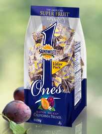
Fruit is such a simple snack. It's been around for centuries and generally doesn't come in any packages. But what about a fruit that has a bad reputation like dried prunes? Sunsweet has rebranded this fruit to appease the masses. Once reminiscent of the elderly and not-so-free-flowing folks, prunes are now the "super fruit." Here's a sample of the new package design by Sunsweet. Who knew?


Some copy off the back:


What makes Sunsweet Ones the most super of the Super Fruits?
Whole Fruit Antioxidants
Studies suggest antioxidants help prevent damage to cells caused by free radicals.
Natural Potassium
Studies link higher intake with lower blood pressure.
All Natural Fiber
Promotes healthy digestion, keeping your system in balance.
To learn more about this remarkable Super Fruit and its amazing attributes visit pop-a-prune.com


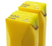
Here are some other interesting packaging designs for fruit juice...another common product that's packaged in unusual ways below.


Thursday, November 11, 2010

Not sure about you, but I'm always looking for new tips for software. Considering Adobe upgrades their software and adds new things about every 2 years or so, it's hard to keep up. And when I find a new trick, it's a little like christmas morning...like I just opened a long-awaited gift. Learn how to rotate your spreads for easy viewing and place images into multiple frames.


Check out the InDesign tips (and other software) at:

Monday, November 8, 2010

3D Print Design

Okay, maybe it's more arts and crafts than fine art, but I love a good invitation or card. Here's a site showing all kinds of great holiday cards created by their team. I particularly like the creativity in designs with layered materials...what I like to call 3D print design. Modern, classic, whimsical – it's all here. The website even has instructions if you want to create them yourself. Maybe this will be my challenge for the holidays, and I'll add my own twist to the design I choose. What's your favorite? Here's mine:

Friday, November 5, 2010

Info Graphics

Since our upcoming project is around info graphics, I though this might be useful to some of you. There is nice variety here, but I particularly like the one about Google Buzz Twitter Reactions. It's simple, yet informative and I find myself staring at it longer and longer to take it in. The colors are great too.
http://designbeep.com/2010/11/05/20-cool-social-media-infographics-to-show-the-power-of-sharing/

Thursday, November 4, 2010

Show & Tell 11-6-10


Narrative:

Check out this link below to a really short video that recaps the movie "A Christmas Story." It pulls in the most important parts of the movie quite well, although having seen the movie many, many times, I just may be filling in bits in between and not realizing it. I love the animation and that fact that every character has the same guy's face. It's humorous. The sound effects are in all the right places, and as fast as this video runs, I'd bet timing all of that was no easy task.

Tuesday, November 2, 2010

Design Tip of the Month

Use guides and measurements. They are there for a reason. And now it's even easier in CS5 because they've made them smart. You don't even have to figure out the exact inch or pixel needed to align something. The software takes a guess and snaps it to the most obvious aligned element. It's so easy, and alignments and margins are what make a design clean. So pay attention to them. Even an extra 5 minutes of scrutinizing these elements will clean up the best designs.

Saturday, October 30, 2010

Name your color...

I came across this interesting site. It's a good resource for color trends and ideas. Seeing other designs that inspire color are a great way to break out of a color rut. You can also create and name your own color. I chose the color below and named it "Fever." I imagine this is the hue added to your cheeks when you are suffering from a temperature of 104 degrees. Click the link below to create your own.


http://www.colourlovers.com/colors/add


Wednesday, October 20, 2010

Design Tip of the Month

Learn to use shortcuts. In today's time crunch world, designers have to pump out groundbreaking ideas over and over again. So save time where you can and learn shortcuts in your programs. You want to spend time working on your concepts and ideas, not finding the layer you saved that image onto so you can move it. So get these into memory as fast as you can:

Adobe InDesign CS5 Shortcuts

Tuesday, October 19, 2010

According to the internet...

play – noun#16:  elusive change or movement, as of light or colors: the playof a searchlight against the night sky.

As I post this month's definition of "play," I think about what it means to me. Elusive change or movement. How can that be transferred into graphic design work. Is it the depth a color gives, the shadows vs. the highlights, or the way a page carries its words? To me, it's all of these things, and why I love the word so much.  

Sunday, October 17, 2010

Vintage Posters

Who doesn't love vintage posters? I can't get enough of them. Their simplicity and complexity works together to create artistic play on paper. I love everything about them. They use unique color schemes and fantastic lines. They may have lacked technology back in the day, but they sure had talent.  Here's a great blog with lots of vintage posters to peruse through:  http://www.postersplease.com

Some samples...I love the color schemes and ridiculous themes. Both are worthy of framing and hanging on my walls.


Friday, October 15, 2010

Show & Tell 10-16-10

Call to action:

I don't know that this has a strong case for argument, but it caught my attention. I'm curious, and willing to look into it further. I'm unsure how a bar code can feed the hungry, and so I did an online search because, clearly, I couldn't ask my local market since this was available a year ago...and in Belgium. It's interesting. You actually scan a barcode in a folder for items that are requested by local shelters and food banks. It makes it easy to turn that barcode into the food needed, hence the graphic. I like it. Simple yet intriguing.


Thursday, October 14, 2010

Hat designs - good outlet for creative fun


I found this site today. Contests like these run the gamut of creativity, and there is some interesting stuff here. I really like this green one below. What would you create for a new hat design?