I have to admit, as much as I hate these Old Spice commercials, I do remember them...and watch them. Do they work? What is so great about them? I know sales spiked after these started running, but why? I guess I'll have to give it to the fact that these are silly ads and maybe they are appealing to a silly generation – one that probably never new Old Spice was even around. It goes to show that sometimes absurd concepts can be exactly what was needed to....uh....spice things up?

Tuesday, November 30, 2010
Thursday, November 25, 2010
Illustrator can do what?
Illustrator is an awesome program. I have the most challenges with it, but feel most rewarded when I accomplish something in it. Vector art is more than art. It's math and art infused together...two things I actual like, and yes, I know it's weird for a designer to like math. I think it's the objectiveness of it. It offsets the subjectiveness of art.
Anyway, many designers steer clear of vector art instead of trying to understand it. And maybe the problem is that we're not aware of its capabilities. Here's a great site that shows some of the wonderful things Illustrator and vector art can accomplish.
http://www.attitudedesign.co.uk/7-things-you-didnt-know-adobe-illustrator-could-do/

Wednesday, November 24, 2010
Photoshop in the wrong hands
I always get nervous when a client says, "I just bought photoshop." People don't buy a mechanic's book and all of the sudden think they can rebuild a Porsche. But why do people insist that all you need to be a good designer is software? Yes, Photoshop is power, and power can be fun. But when you suck at it, you just look stupid. Check out these award-winning Photoshop jobs...sadly done by some professionals, it seems.


Tuesday, November 23, 2010
Hard topics, good ads
When the subject is tough, creating an ad that get the message across can also be tough. Heavy topics like obesity and drunk driving can stop a designer in their tracks. You've got to find the fine line between cliche and effective. Visually representing statistics in a way that gets someone to stop and read an ad is not a goal many can reach. Below are some examples of ads that did a good job. Simple yet effective.


Saturday, November 20, 2010
Show & Tell 11-20-10
Info graphics - the good, the bad, and the ugly...
I'm hoping that I'm not the only one who is still having a little difficulty in determining what makes a great info graphic and what makes a mess. It's supposed to be engaging and not easily understood at first, yet not confusing or misconstrued. You want your audience to enjoy looking at it, but it shouldn't be covered in images and graphics that don't have meaning. All in all, this may be the biggest challenge of my career yet...but I'm working on it. In the meantime, checking out samples online helps at least to conjure up ideas. Here are few of recent ones I've found:
I actually think the main gaphic is interesting, showing overlapping time in his career between academics and employment. I'm still unsure if this is good for the purpose of a resume though. Does it obscure the data too much? I agree the bottom two graphs are maybe overkill, but I'm still digging the main info graphic here.

Below are some examples of info graphics that could use a little work. The complexity of the graphics in the geological timeline overpowers the actual information you get from it. Additionally, the Weatherford one is basically a flow chart, mixed with terrible clip art characters and scenes. No real exciting information here. And as for the video game stats, this is a lot of data that is related, but not dependently, and covered up with colors and graphics galore. To me, these are uninspired info graphics, even if it did take the artist countless hours to create.


Tuesday, November 16, 2010
When B&W is better
I used to have a boss that said, "It's printing in full color, so USE full color." I never understood this. Why does maximum color always work? Will more color sell the product more? Will it gain more attention? I think not. My current job uses a campaign with only B&W images, which I love. We can still add color, but it's purposeful and challenging. I disagree that color is always better, and so I've found some ads to post as a tribute to the B&W movement. Enjoy.


Monday, November 15, 2010
According to the internet...
play – noun#17: a space in which something, as a part of a mechanism, can move
As I post this month's definition of "play," I think about what it means to me. This one reminds me of white space. It's so important on a page. People forget about it like it doesn't exist. I had a coworker ask me why white was not a color in printing. I said, "It is. It's just already present on the paper and you have to work with it." She looked at me quite funny and just walked away, probably mumbling something about crazy designers. Here's to you white space, and all your purpose and poise.
Friday, November 12, 2010
Show & Tell 11-13-10
Packaging:
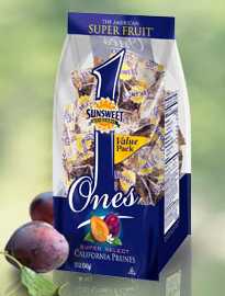 Fruit is such a simple snack. It's been around for centuries and generally doesn't come in any packages. But what about a fruit that has a bad reputation like dried prunes? Sunsweet has rebranded this fruit to appease the masses. Once reminiscent of the elderly and not-so-free-flowing folks, prunes are now the "super fruit." Here's a sample of the new package design by Sunsweet. Who knew?
Some copy off the back:
What makes Sunsweet Ones the most super of the Super Fruits?
Whole Fruit Antioxidants
Studies suggest antioxidants help prevent damage to cells caused by free radicals.
Natural Potassium
Studies link higher intake with lower blood pressure.
All Natural Fiber
Promotes healthy digestion, keeping your system in balance.
To learn more about this remarkable Super Fruit and its amazing attributes visit pop-a-prune.com
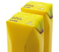
Here are some other interesting packaging designs for fruit juice...another common product that's packaged in unusual ways below.


Fruit is such a simple snack. It's been around for centuries and generally doesn't come in any packages. But what about a fruit that has a bad reputation like dried prunes? Sunsweet has rebranded this fruit to appease the masses. Once reminiscent of the elderly and not-so-free-flowing folks, prunes are now the "super fruit." Here's a sample of the new package design by Sunsweet. Who knew?Some copy off the back:
What makes Sunsweet Ones the most super of the Super Fruits?
Whole Fruit Antioxidants
Studies suggest antioxidants help prevent damage to cells caused by free radicals.
Natural Potassium
Studies link higher intake with lower blood pressure.
All Natural Fiber
Promotes healthy digestion, keeping your system in balance.
To learn more about this remarkable Super Fruit and its amazing attributes visit pop-a-prune.com
Here are some other interesting packaging designs for fruit juice...another common product that's packaged in unusual ways below.


Thursday, November 11, 2010
Not sure about you, but I'm always looking for new tips for software. Considering Adobe upgrades their software and adds new things about every 2 years or so, it's hard to keep up. And when I find a new trick, it's a little like christmas morning...like I just opened a long-awaited gift. Learn how to rotate your spreads for easy viewing and place images into multiple frames.

Check out the InDesign tips (and other software) at:
Monday, November 8, 2010
3D Print Design
Okay, maybe it's more arts and crafts than fine art, but I love a good invitation or card. Here's a site showing all kinds of great holiday cards created by their team. I particularly like the creativity in designs with layered materials...what I like to call 3D print design. Modern, classic, whimsical – it's all here. The website even has instructions if you want to create them yourself. Maybe this will be my challenge for the holidays, and I'll add my own twist to the design I choose. What's your favorite? Here's mine:


Friday, November 5, 2010
Info Graphics
Since our upcoming project is around info graphics, I though this might be useful to some of you. There is nice variety here, but I particularly like the one about Google Buzz Twitter Reactions. It's simple, yet informative and I find myself staring at it longer and longer to take it in. The colors are great too.
http://designbeep.com/2010/11/05/20-cool-social-media-infographics-to-show-the-power-of-sharing/
http://designbeep.com/2010/11/05/20-cool-social-media-infographics-to-show-the-power-of-sharing/
Thursday, November 4, 2010
Show & Tell 11-6-10
Narrative:
Check out this link below to a really short video that recaps the movie "A Christmas Story." It pulls in the most important parts of the movie quite well, although having seen the movie many, many times, I just may be filling in bits in between and not realizing it. I love the animation and that fact that every character has the same guy's face. It's humorous. The sound effects are in all the right places, and as fast as this video runs, I'd bet timing all of that was no easy task.
Tuesday, November 2, 2010
Design Tip of the Month
Use guides and measurements. They are there for a reason. And now it's even easier in CS5 because they've made them smart. You don't even have to figure out the exact inch or pixel needed to align something. The software takes a guess and snaps it to the most obvious aligned element. It's so easy, and alignments and margins are what make a design clean. So pay attention to them. Even an extra 5 minutes of scrutinizing these elements will clean up the best designs.
Subscribe to:
Posts (Atom)