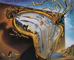
Clever. Take Salvador Dali's melted clocks and revive it in your next advertising campaign. And what could be a better combination than a steamy day on the court. Congratulations Perrier, you officially made tennis interesting for me.
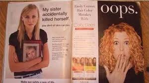
One of the most important steps in advertising is not design, color, or images, but placement. You wouldn't put an ad for cigarettes next to an ad for lung cancer awareness, or would you? Placement of your ad is important in sending the right message. Here are a few that missed the mark:
If you've never visited http://fontstruct.com/, you are in for a real treat. Not that it's easy, but with the right determination and thought you can design your OWN font. I've tried it, and although I was not as successful as I'd hoped, I'm intrigued to try again. Here are a few of the letters I created. My letters are interesting, but don't necessarily feel like a family. I guess that's the hard part trying to have an element that ties the font together as a group.
I work in advertising and marketing for a health insurance company. I mostly love it, although there is a certain time of year that swallows me hole...the dreaded busy enrollment season. I'm thankful that the days go fast, but wish I had more time to spend on my designs and with my designers. Sadly, what suffers here is the work. Cranking out designs and layouts one after another leads to monotony. Each season I look back and think about all the things I should have or could have done, if I only had the time. I guess the good news is that after busy season comes slow season. It's then that I get to explore and have fun with designing again. And I'm missing that season very much right now as I try to balance my workload and creativity at the same time. Wish me luck!
I came across Jose Ciceraro's Portfolio and thought it was worth posting about. He's got amazing talent with Photoshop. His layering technique is flawless as seen in some of his print designs. Not only are his designs worth viewing, but his site is well designed too. Maybe when my web skills are better, I can work on having something as accessible and good-looking as this. Here's my favorite print piece off his site:
These things don't go together, but represent each category well. Not sure who thought this picture would make me want to cook the recipe...on the other hand, the article does inspire me to experiment with wine and cooking. I truly sympathize with my husband, as he will be my guinea pig.