pages

Sunday, October 17, 2010

Vintage Posters

Who doesn't love vintage posters? I can't get enough of them. Their simplicity and complexity works together to create artistic play on paper. I love everything about them. They use unique color schemes and fantastic lines. They may have lacked technology back in the day, but they sure had talent.  Here's a great blog with lots of vintage posters to peruse through:  http://www.postersplease.com

Some samples...I love the color schemes and ridiculous themes. Both are worthy of framing and hanging on my walls.


Friday, October 15, 2010

Show & Tell 10-16-10

Call to action:

I don't know that this has a strong case for argument, but it caught my attention. I'm curious, and willing to look into it further. I'm unsure how a bar code can feed the hungry, and so I did an online search because, clearly, I couldn't ask my local market since this was available a year ago...and in Belgium. It's interesting. You actually scan a barcode in a folder for items that are requested by local shelters and food banks. It makes it easy to turn that barcode into the food needed, hence the graphic. I like it. Simple yet intriguing.


Thursday, October 14, 2010

Hat designs - good outlet for creative fun


I found this site today. Contests like these run the gamut of creativity, and there is some interesting stuff here. I really like this green one below. What would you create for a new hat design?


Saturday, October 9, 2010

The Color Matching Challenge

"Get your colors as close as you can, but don’t sweat perfect. Close enough really is good enough."


This advice came from a blog I was reading (http://www.mcwade.com/DesignTalk/2010/10/) – and I think it's good advice. A perfect match in color is sort of bland, if you ask me. Subtle differences in swatches add dimension to a layout. If you've got an image that you want to pull color from, you can surely use the handy-dandy eyedropper tool. But maybe taking those few extra moments to use your own peepers and pick something close and complimentary is better. 

Friday, October 8, 2010

Show & Tell 10-09-10

Campaigns:
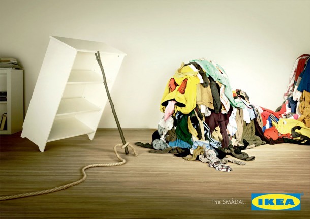
I particularly like the artistic value of the Intermix campaign, but the playful concept of the Ikea ads really grabbed my attention. Simple concept: Ikea storage traps monster mess. It works.


Monday, October 4, 2010

Nouns are used for a reason...

When print or display space is limited, important words will be eliminated.

Sunday, October 3, 2010

Superbowl Ads

I like football, but don't love it. My husband spends countless hours watching the games, while I just wait patiently for the big one. That's right, the Super Bowl. Although, it's not the game I'm most excited about, it's the ads. Worthless as most are at doing the real job of an advertisement, which is to sell me something, I still love to watch them. Super Bowl ads have become a form of entertainment to viewers. And they are sort of like swimmies – sure they are fun but no one puts any real faith in them to do their job.

Check out the archives for your entertainment viewing pleasure!

http://superbowl-ads.com/article_archive/